I started designing Brevier in 2007 because I needed a type for continuous texts at very small sizes – not more than 4 or 5 points.
My interest in early roman type had some influence on the design but my approach to the work was also important. It was my first type design and I decided to work like a punch cutter, cutting one size of type. Nonetheless, Brevier works very well at 4 points and at 8 points too. But at 9 points it starts looking weird. At 10 points it's fairly ugly and at 12 it's very ugly. Printed larger than 20 points the Brevier letters seem to bear no resemblance at all to the very small sizes.
While working on Brevier I studied a lot of proofs printed on different machines. Then I pumped up the counters until they burst. I put deep ink traps into the inside angles and left the connections left open.

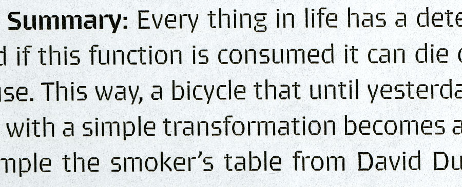
Brevier regular 7/10 pts, offset on Antalis Serixo 100 g. (scan at 600 dpi)
The difference between Brevier printed on paper and Brevier on a screen is very clear and this causes problems in marketing the font. Few people have been able to appreciate Brevier's performance on paper.

Same as before, scanned at 300 dpi.

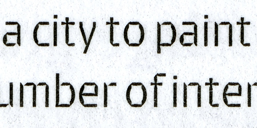
Again, here scanned at 2400 dpi.

Brevier regular 3 pts, offset on UnoWeb glossy 60 g. (scanned at 2400 dpi). Photo credits on magazine.

Same as before, Brevier regular 2,5 pts.
I often use Brevier when I need a small type. It's not a pretty face but it's a real workhorse and the letterforms have retained a contemporary look – especially in the italic version.