When I began designing Gramma, in the summer of 2009, my goal was to create a compact sans serif with sizeable letter height, one that would work well both for headers and titles as well as main bodies of text. I also — and this is a risky ambition in type design — wanted it to have some personality. I began by working on the rustic capitals — I’ve always found its compact, rhythmic forms attractive — but after the first few attempts I realized that the proportions were too far from what we’re used to, and their geometric synthesis produced extravagant forms.
I then abandoned rustic — but not its compactness — and continued the geometric quest: that’s when I decided to look to humanist letterforms, using them as points of reference for details and proportions. At the same time, alongside Michele Patanè, I was completing an investigation of letter width and proportions. We compared alphabets from different places – from macro reproductions of De Aetna to old Monotype catalogues of Dante and Fred Smeijers’s digital Quadraat — and this research influenced a lot of the choices made while designing Gramma.
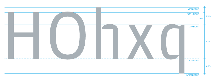
The result was a robust yet balanced typeface. The initial constructions, assembled from a few well-defined geometric modules, were polished into more organic forms; a bit of geometric orthodoxy remains, for example, in the shoulder of the n. The letters’ arches are quite squared, and the counters and other internal negative spaces push outward, creating a tension that balances the forms’ compression.
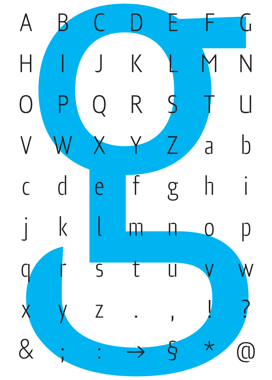
Gramma’s most evident characteristic is its “bird-beak” terminals (present in many letters, including the c, e, f, s...) that replicate the unconnected junctures between stem and curve, visible in the a, b, d, g, h… This lack of connection, much like stenciled letters, is reminiscent of Francesco Simoncini’s (unjustly forgotten) experiments of the sixties. Even if Gramma’s letterforms have nothing to do with that period, such forms are absolutely contemporary. We’ll just have to wait and see whether they manage to remain current well into the future.
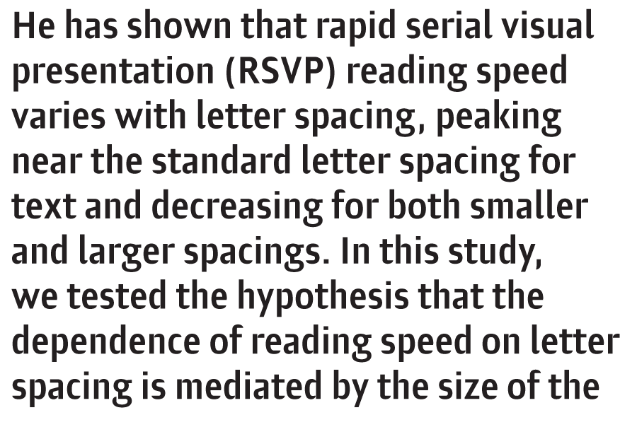
One factor in letter design that’s always fascinated me is the micro- and macro-reading of the forms: the digital letters we design can be reproduced at any size, from minute to gigantic, and such size differences alter their visual perception. With Gramma, I played around with that peculiarity. When it’s reproduced on a small scale, the unconnected junctures tend to close up and the beak- shaped terminals are softened. Such alterations are optimal for long texts, when lengthier reading mustn’t be interrupted by any extravagant elements.
Published on Progetto Grafico 21, 2012. English translation by Alta Price.