Parmigiano is a large font family introduced in 2013 to celebrate the spirit of Giambattista Bodoni, 200 years after his death.
Bodoni’s roman types followed the so-called ‘modern’ trend of his time which was started in the late 18th-century by his main competitors, the Didot family in Paris. Thin, horizontal serifs, vertical axes, high contrast between thick and thin strokes and round terminations on certain lowercase letters are the main features of these faces.
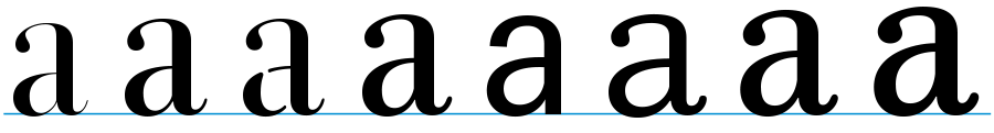
Bodoni experimented with variations in the details and proportions of his roman letters. In his Manuale Tipografico, published by his widow in 1818, we find 142 series of romans and there are several shapes for a, g, s, and other letters. Given this variety, to talk of a single Bodoni font seems illusory.
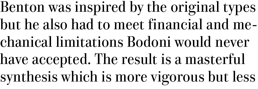
Designing Parmigiano I eschewed a philological approach and kept a distance from 20th-century revivals – as ATF Bodoni, designed by Morris Fuller Benton in 1910, the first face to take the name of Bodoni and the most important revival with that name. My intention was to interpret Bodoni according to contemporary taste. I retained some of the recurring details of his work but the proportions of the letters, the styles and other design decisions are entirely contemporary.
 The Parmigiano styles published in 2014
Parmigiano features different cuts for use in specific point size ranges, but I added morphological alteration to the typical optical adjustments. To represent the stylistic variety of Latin letters cut by Bodoni, I changed the proportions of the bowls of a, e and g, the softness of the arches and other minor details.
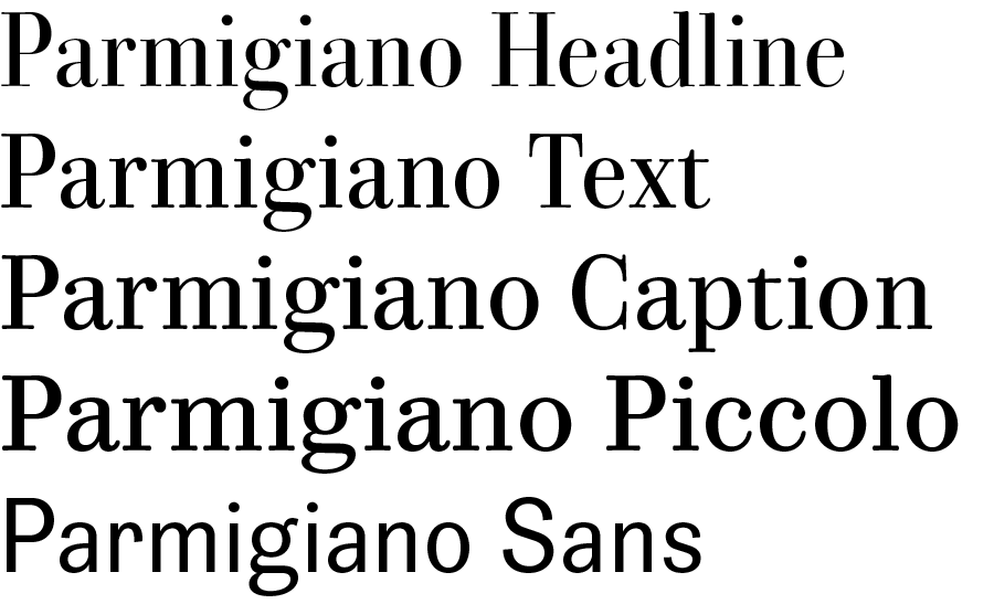
 The whole family: Parmigiano Grande, Headline, Stencil, Text, Sans, Typewriter, Caption and Piccolo
The results are contemporary designs that aspire to be irreverent descendants of Bodoni’s letterforms. Bodoni never cut a sanserif (this style came in a few years after his death); neither did he cut typewriter or stencil styles which were introduced many decades later. The Parmigiano Piccolo style, with its rather clumsy proportions belongs to that same period; it is a parody of 19th century typefaces, a gross and ungraceful workhorse. Bodoni never cut such shapes and we can presume that he would feel offended by my choices.
 Parmigiano Text, Piccolo and Sans
Jonathan Pierini, friend and former colleague at the University of Bolzano, co-designed many styles and helped menaging, along with Massimo Gonzato, the Compulsive Bodoni project.
Compulsive Bodoni is the name of the on-going project, started in 2012, that publicizes the ideas of the Parmigiano Typographic System. It introduces the font system and follows its development with a series of multidisciplinary events and exhibitions.
The first styles of Parmigiano were published on the Typoteque font library in summer 2014, Cyrillic, Greek (designed by native-script typedesigners) and other Latin styles are in progress and will be issued later in 2015.
The process of designing Parmigiano was explained in a Typoteque article.
The complete specimen of the published Parmigiano styles.