A new member of Parmigiano family was released in 2015. Parmigiano Stencil is the legitimate but irreverent descendant of Bodoni’s typefaces, probably the most distant in style from the grace and grandeur that Bodoni strived for.


We can presume that Bodoni saw stencilled letters during his lifetime because this technique was used on the pages of liturgical books, and many secular goods too [*]. But he never thought about including such letters in his collection of typefaces because stencils were imitations of printed letters, and Bodoni probably considered them as a plebeian degradation of printing type. Indeed the first stencil typeface saw the light in 1885, when Bodoni had been lying in his grave for more than 70 years.
Due to the position of the stencil ‘cuts’ and their shapes, Parmigiano Stencil shows characteristics that distinguish it from most of the stencil typefaces on the market.
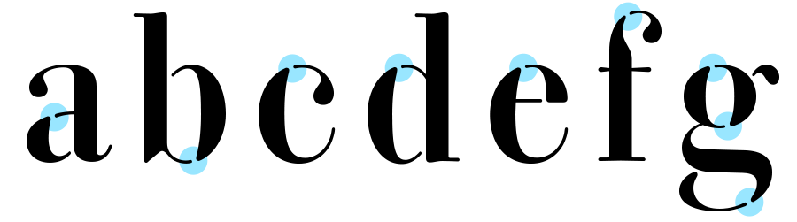
Firstly, those cuts do not follow the vertical axis but they are placed according to the shape of the curves, where the strokes change from thin to thick. This exploits the abrupt modulation of the stroke – one of the main features of neoclassical faces. Moreover, the positions of the cuts preserve the thin strokes that are left in their entirety – as the cuts always fall at the end of the thin strokes, where they start to swell.

Secondly, the cuts do not look like real cuts: they do not seem to be produced by some tool which has cropped portions of strokes. At a first glance it does not seem that part of a stroke is missing, because the cuts reproduce the same shapes of recurrent details of the type such as serifs and terminations. This consistent treatment makes each letter of Parmigiano Stencil look as if it were assembled by different elements of a system, rather than single letters cut into different pieces.
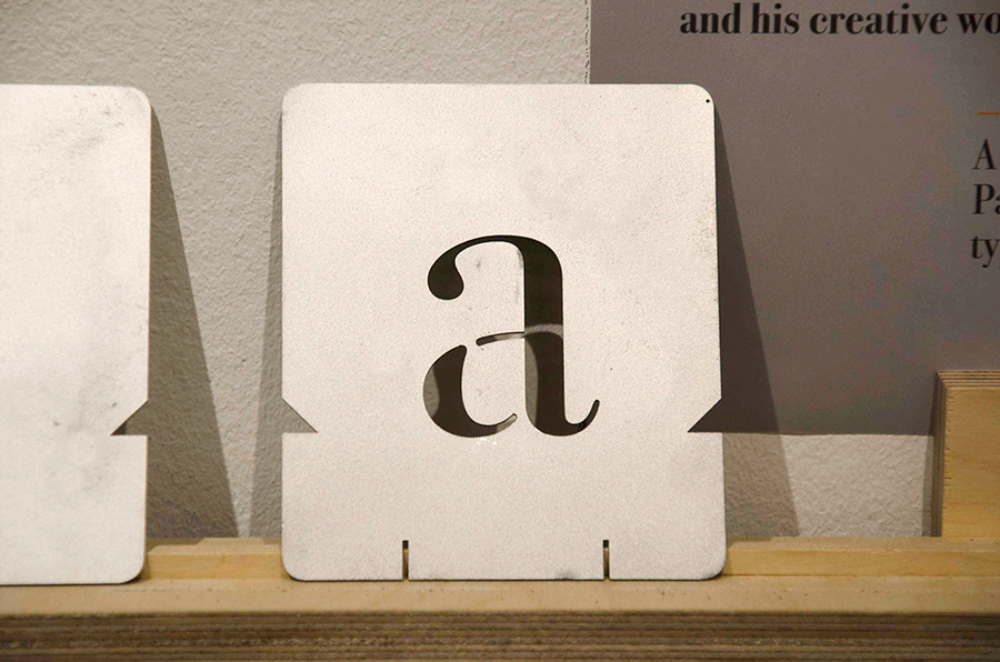 Metal stencil displayed at the Parmigiano exhibition, UvA Special Collections, Amsterdam, October 2013.
[*] I asked Eric Kindel if stencilled letters were popular in the 18th century and – after admitting that it was a difficult question to answer in an Italian context – he noted: ‘Stencil letters were certainly around and known about in Italy, and one would expect someone like Bodoni (and indeed most anyone associated with letterforms and their production) to be aware of them. There is evidence of the production of stencilled liturgical books in Italy in the 18th and 19th centuries, mainly in Rome, though I predict that evidence will soon emerge of the wider spread of such work. In France in the 18th and 19th centuries, in addition to their use for liturgical books, stencil letters were employed for various kinds of notices, announcements and inscriptions, or for large-format accounting ‘spreadsheets’; at a smaller scale, they were used for bookplates and marks of ownership, labels for packaged goods (such as pharmaceuticals), cartes de visite, billheads and receipts, and much else. The stated aim, by and large, was to ‘imitate printing characters’, i.e. printing types, though it appears that the letterforms imitated in fact came from a number of sources.
Parmigiano Stencil is on sale at typotheque.