In the winter 2013–14, during my master course in Reading, I analyzed the Hypnerotomachia capitals to see if I could borrow details and proportion for Zenon, the typeface I was designing.
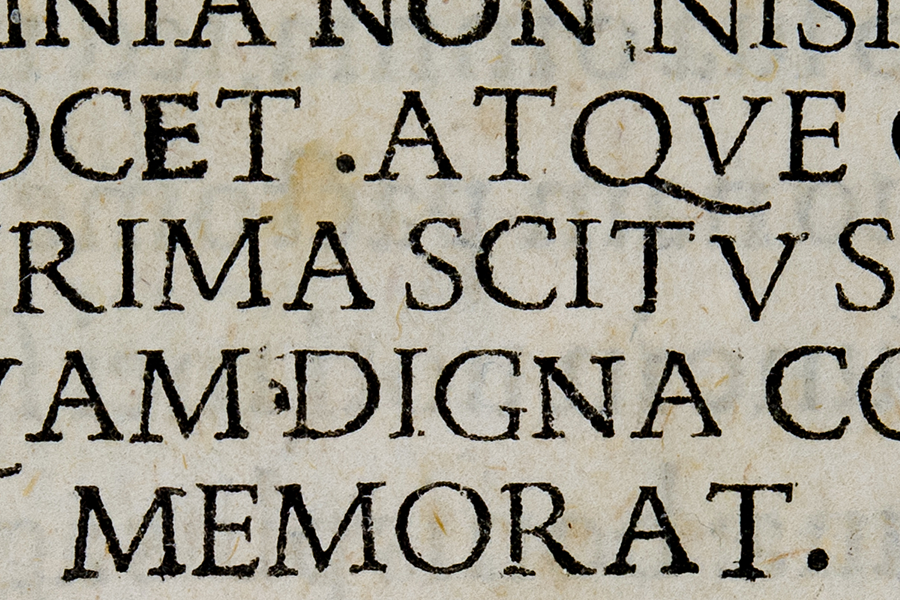
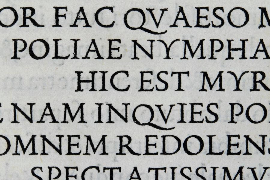
In 1499 Aldus replaced the De Aetna uppercase with new, more epigraphic letters, cut by Francesco Griffo, which were to become famous with the Hypnerotomachia Poliphili – one of the most celebrated books of the Renaissance.
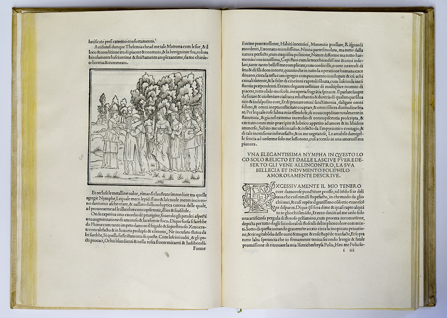
Griffo’s model is clearly the Roman Imperial capitals carved in stone and so easy to find all around Italy at the time; the upper case letters in the book ‘exhibit to the full the deliberate inscriptional quality of the design and emphasize it by the use of the spread M, long-tailed Q and R (S. Morison, Poliphilus roman, from A Tally of Types, 1973, 55).
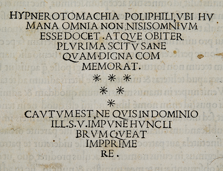
I have worked on macro photos of the original edition of the book, taken at the Civica library of Verona. I have analyzed the proportions of the letters, traced the most important shapes, superimposed letters to understand the difference in proportion.
In the end Zenon caps came out quite different from the model I chose. I polished down many of the strongest features of Hypnerotomachia caps because they looked awkward on the screen. I basically regularized the widths of letters like tightening C and N that were originally extremely wide.
Some worksheets of Hypnerotomachia Caps in pdf.