Zenon (from Greek: Ζήνων) is the name of the main character of the novel Œuvre au Noir (Marguerite Yourcenar, 1953). He was a Belgian alchemist, physician and humanist of the sixteenth century, interested in the human body.
The novel is historically accurate but the main character is fictional. Yourcenar invented Zenon as the sum of historical figures like Erasmus of Rotterdam, Paracelsus, Servetus, but also Leonardo da Vinci and Tommaso Campanella. She picked up details from the life of each of these great men.
Similarly, Zenon type is a sum of different styles, from Francesco Griffo to Granjon, from modern typefaces to the first sketches of Times New Roman. Zenon is an apparently Renaissance revival with modernish proportions. A closer look reveals that it is a typographic potpourri.

Zenon was my Reading typeface, I designed it as part of the MATD program at the University of Reading.
I went to Reading with some ideas in mind; my aim was to design an old-face without falling into a revival, an old-face that could fit snugly into a contemporary environment. A hardworking Roman character, not too outspoken, slightly dark on the page, with little contrast and quite compressed letters. To contrast its quietness I would have match it with an outspoken Italic.
I’d have tried to play with contrast between a general roundness and some touch of angularity – sharp, pointed strokes, like the triangular upper serifs in the lowercase.
In cuisine you create a contrast of flavours even when you want to balance one that is too intense. For instance an oily recipe must be corrected with some- thing acidic like adding lemon to the mayonnaise.
I felt that the softness of my letterforms could be boring, they needed some spiky strokes to balance them.

The field of application was intended to be publishing in general, magazine and other publications printed at any quality and with methods from offset to low quality laser printing, to silkscreen printing. Though I had in mind a rather dark one (while today we are used to lighter characters for screen) my aim was to design a typeface that works well on screen as well as devices for online publications like blogs, e-magazine and online news.
Tablets and smartphones (where the reader changes size of the pages as a common movement for analysing contents) would be the perfect environment for my face: it could display its performance on long texts, easy readable when small and would be able to successfully display its crafted details when enlarged.

Zenon Roman
Its main features are:
. the letterforms are condensed and robust, they are able to withstand low quality printing;
. letters, figures and all glyphs are slightly sloped (about 2 degrees);
. the stress angle is oblique, low contrast in the regular weight, more contrast in the Black;
. the stems are slightly flared towards the top;
. the junctions between arches and stems are thin, thinner than the arches of the letters;
. the upper terminals are rounded but they abruptly sharpen;
. the letterforms were not designed to recall a specific tool, they look like the product of a mixture of tools: pen, knife, chisels. Actually they are the product of one tool: the computer.
All these ingredients lead to an organic design, slightly irregular on the page.

Finally the lowercase shows modern overall proportions (similarity of letter widths) while the upper case has an Imperial epigraphic flavour (see the Poliphilus Caps analysis to follow the process of designing Zenon caps).

Zenon Italic
For the Italic I decided to follow the chancery cursive of the 16th-century and I studied several Granjon’s italics.
Vervliet divides Granjon’s italic into four stages or styles that evolve along his career. I focused on one model of his second style, the so called mature couchées italic, and another one from his fourth style, the extreme Baroque italics, cut towards the end of his life.
I liked both the elegance and the smoothness of the couchées style and the angularity and the big counters of Granjon’s Baroque types. Like for Zenon roman, my aim was to try a synthesis, to combine these different characteristics in one design.

Then I studied the work of some master calligraphers of the 15th century, that were certainly studied by Granjon too. From the Vatican scriptor Gianfrancesco Cresci, from his highly cursive, free-flowing hand, I borrowed the wide and strongly asymmetric serifs that he was using at the bottom of descenders, applying these shapes to the uppercase letters too.
The letters are sloped with an angle of about 9 degrees and quite compressed, the connections of n, b, etc are deep; so deep that it was a problem with the bolder weights and I had to struggle to find a good solution.
The result, as I see it, is a lively, spiky, narrow chancery italic that stands with its own personality beside Zenon roman.
Other scripts
The Reading MATD teaching includes a deepen on non-Latin scripts. For Zenon I designed Greek, Cyrillic and Bengali.

Zenon Greek
After studying some historical models (Firmin Didot’s Greek types and Garamond’s Grecs du Roi above all), I soon realized I did not want to design a Latinized Greek with vertical stress angle, like many western Greek types of the past decades.

I stuck to the more traditional horizontal stress angle, even for the Black, accepting the big difference in structure with the Latin. To match the colour of the Latin on the page I designed the Greek letters quite round; the widths are generous compared with the more compressed Latin.

Zenon Cyrillic
There are no historical examples of old-face cyrillic: ‘Cyrillic never had its own Carolingian minuscules, nor a correlate to its later incarnation, the humanistic hand, from whose shapes the contemporary Cyrillic lowercase letterforms could have gradually evolved’(M. Zhukov, The peculiarities of Cyrillic letterforms, 7).

Therefore the problem I had to face was how to insert elements of Renais- sance type design in my Cyrillic, still keeping the letterforms at their standard appearance familiar to today’s readers. The main troubles were the angle of stress in the round forms (usually vertical in Cyrillic), the contrast in stroke weight (more accentuated than the average contrast of Zenon), and details of construction of certain letters.
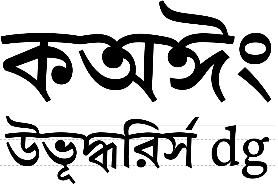
Zenon Bengali
I started the Bengali shortly after the Latin and the development of the main letters advanced in parallel. I made many attempts and tests to match the two scripts trying to reach an optical balance. The task was a difficult one because the density and the activity zones of Bengali and Latin can be far too different. Many problems were caused by the depth of Bengali that anyway always looks better with larger interlinear space than Latin.

The main feature of Zenon Bengali is definitely the curved headline. I noticed that in the Bengali handwriting practice the headline is not straight, like in Devanagari, but slightly arched, curvy, with organic connections between letters.
Without any previous knowledge of north Indian scripts I studied the basic structure of Bengali script and I took some historical models as a starting point: I studied some 18th century manuscripts like the Vidyasundara, and the Figgin’s Bengali typeface cut in London in the beginning of the 19th century. Only in a second stage, after designing the basic letters, I was introduced to the Linotype-Paul Bengali (designed by Tim Halloway and Fiona Ross for digital phototypesetting and produced in 1982), the essential model of all the Bengali typefaces till today.
Right now I’m fine tuning the Latin styles, leaving the rest for later.
The complete specimen of Zenon updated in real-time.
The MATD Specimen designed in July 2014.